 |
 |
 |
 |
 |
 |
 |
 |
 |
< |
 |
> |
|
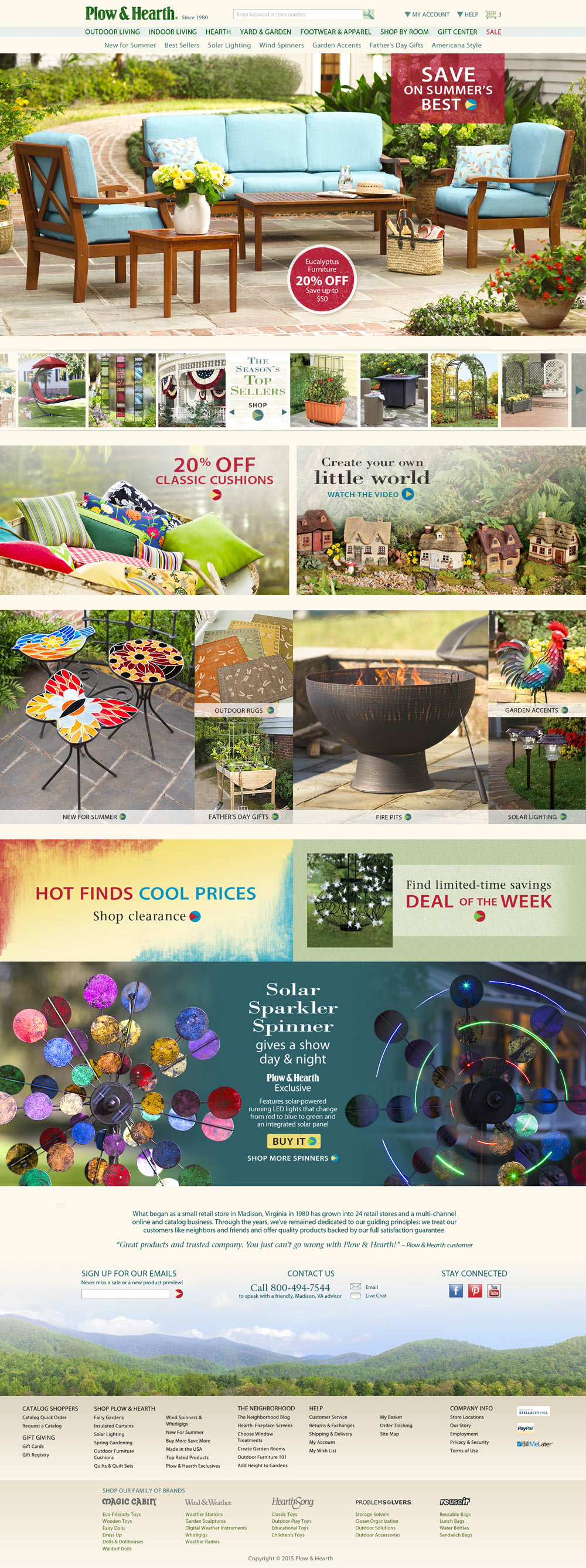
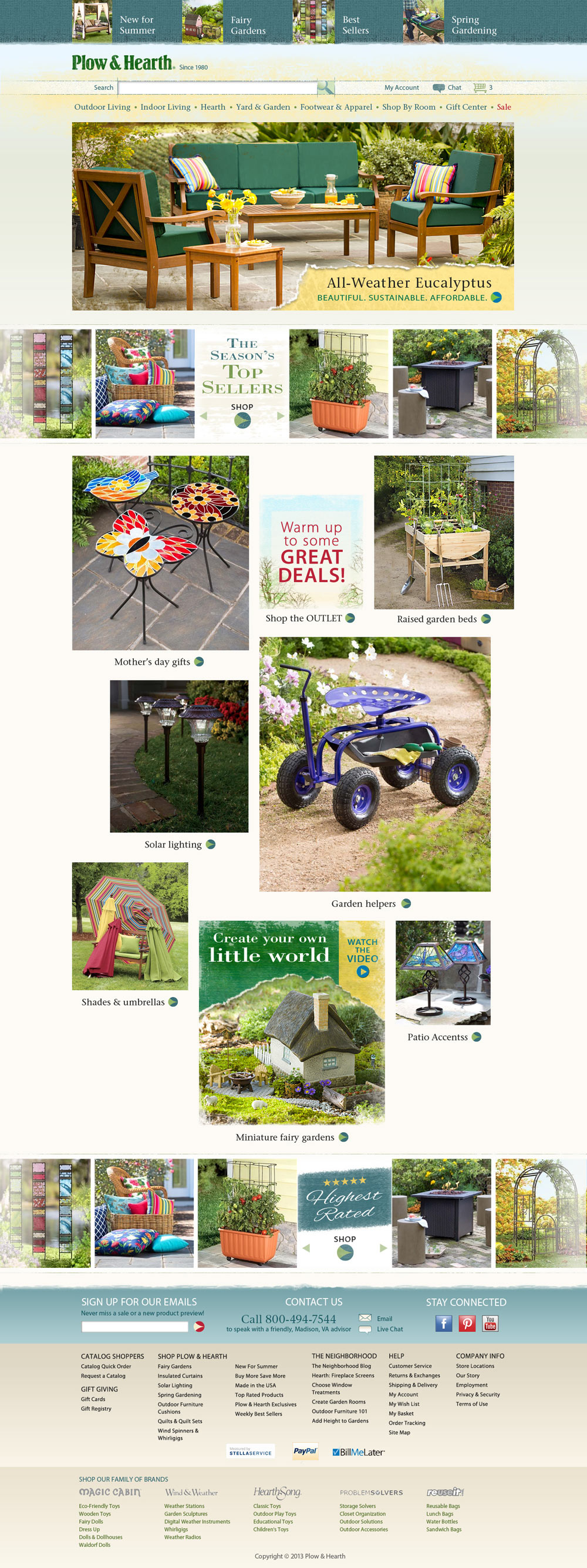
Here is my most recent homepage design for Plow & Hearth. The objective was to accommodate a wider average screen size plus be responsive for narrower screens on down to tablets. This design was years in the making; scroll down to have a look at our humble beginnings and the changes over time. |

|
|
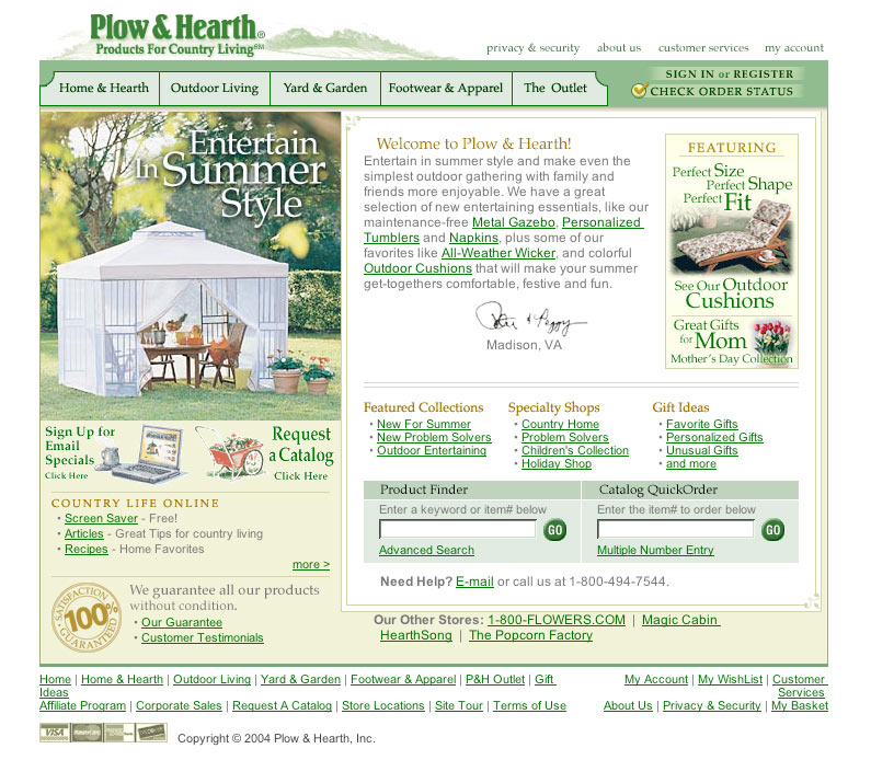
This is how the Plow&Hearth site looked before any creative re-design (circa 2004). Very crude and text-heavy. |

|
|
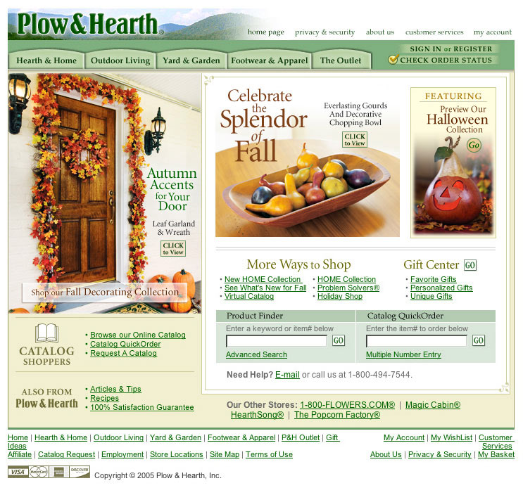
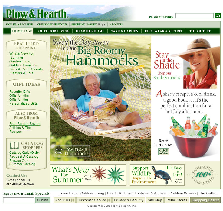
In 2005 I was given the opportunity to clean up the design, without altering any underlying structure. More attractive header and navigation. A little more imagery, a little less text. |

|
|
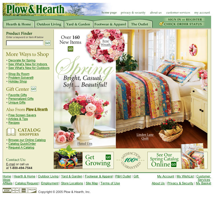
Next - switch to traditional left-side navigation and big splashy panel showing off rich colors and textures of our products. |

|
|
Further refinements: More contemporary top navigation and image headers to break up side navigation text. |

|
|
Design-by-commitee: the desire was to go wider and greatly expand click opportunities with scrolling panels, but the result was very busy and not a step forward for the brand. |

|
|
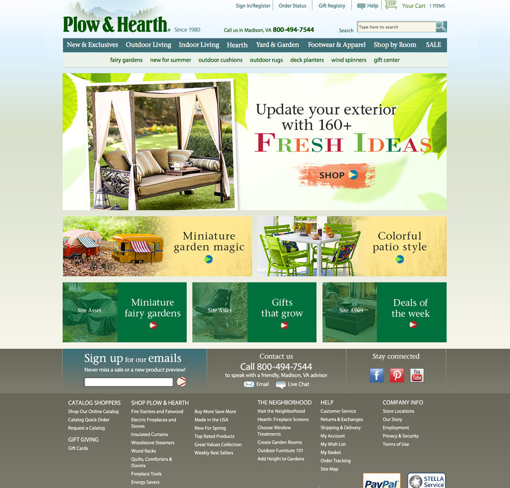
New site platform and complete design refresh restored the warmth of the brand and expanded ways to shop. |

|
|
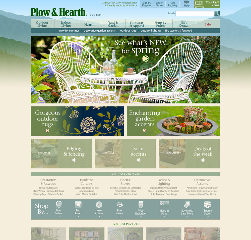
Softer look with lighter coloration, plus narrower focus of message, more traditional header layout. |

|
|
Another suggested re-visioning of the design. An asymmetrical precursor to the final design at the top of the page. |

|